PLAYBOOK
Playbook is a visual storage and collaboration platform designed for creatives managing large visual libraries. I joined the team as an early designer, guiding Playbook through several key product launches and our first few monetization growth initiatives.
Over 2 years, I worked on a range of projects, from refining existing interactions to building completely new functionalities and use cases. Here are some of the projects I worked on.
Miniapp Shop
Building an embedded creative ecosystem
Background
My first project when I joined Playbook was to push forward a new initiative and business division: “The Ecosystem Pod” alongside Max, my co-lead and backend engineer.
At the time, Playbook was starting to grow beyond core storage and file management and into a full fledged creative operating system. The Ecosystem project was a bet on embedding third-party creative tools into Playbook as a way to reach new users and open up new vectors for growth, revenue, and differentiation. By enabling users to do quick, last-mile creative work—remove a background, convert a file, add watermarks—without ever leaving their asset library, we'd solve a real workflow pain point while creating new monetization streams on top of our core DAM subscription.

My Role
The Ecosystem pod was just two people: Max (backend engineer, billing infrastructure) and me. My role spanned from product strategy to design and implementation of the embedded experience to marketing rollout for each new app.
What We Built
Over 8 months, we shipped 10 embedded miniapps including tools for background replacement, vectorization, file type conversion, and more. Early on, we prioritized speed, aiming to get our first ~5 mini-apps out quickly to beta testers. Early signs were encouraging; completion rates were high, adoption was growing, and MRR contribution hit 8%.
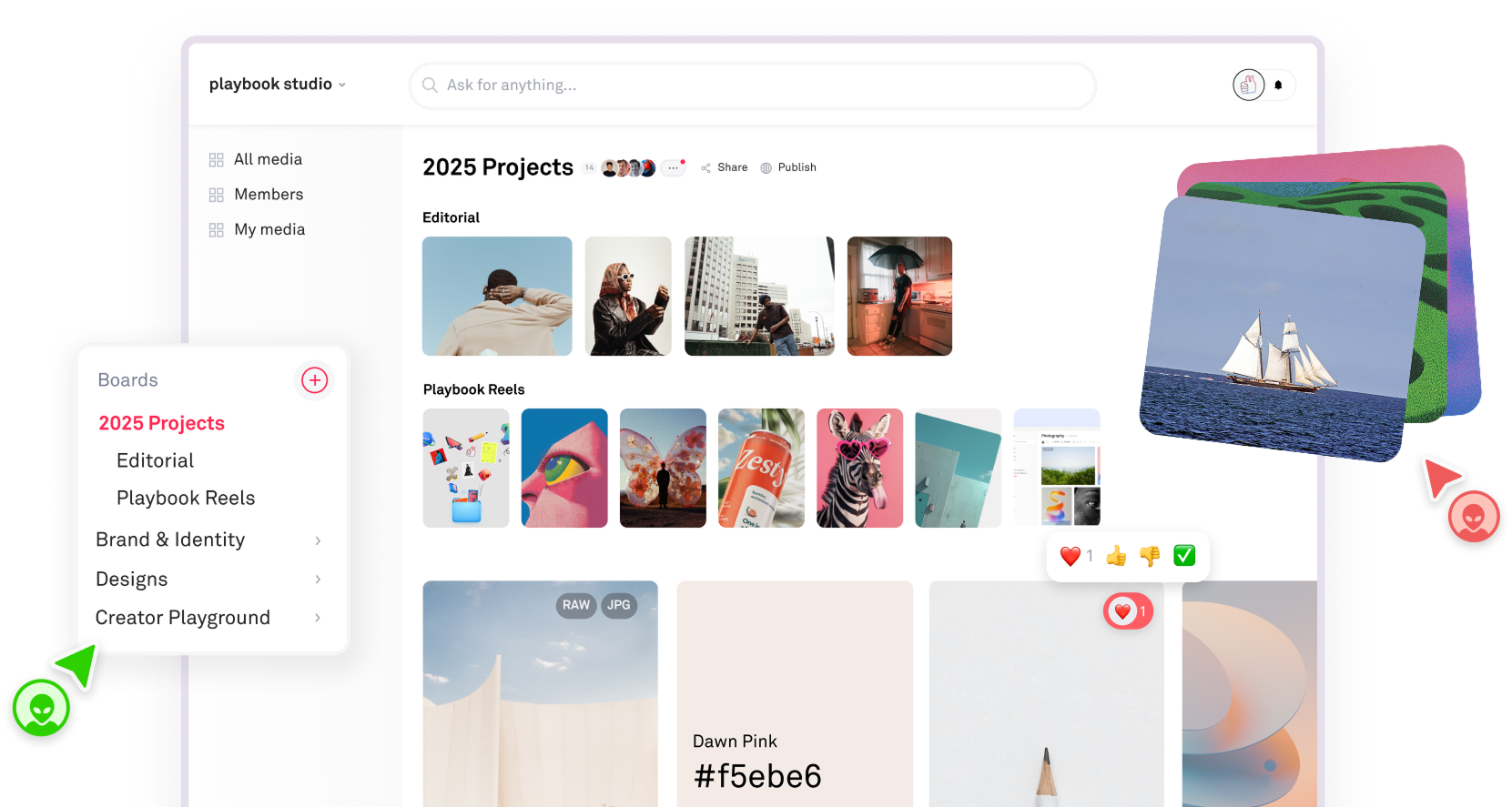
I redesigned the main entry point: the original Miniapp Shop was a separate popup modal, which felt disconnected from the actual workflow. I moved it into a dropdown embedded directly in the asset view toolbar, so users could trigger tools right where they were already working. A small change that made a big difference in how native the experience felt.
The Pivot
As we released more apps and collected more data, a clearer picture emerged. High mini-app traffic did not mean we reached our target audience. One launch drove 30K visits with fewer than 0.02% converting to a paid Playbook user. We were capturing curious one-time visitors, not users with a real need for our core storage product.
The process was also becoming less scalable. Each integration required auditing a partner's API, designing an embedded experience, implementing it, and launching it independently. Regardless of how we priced each mini-app, paid conversions stayed low. Users already paying for Playbook didn't expect or want to pay again for individual tools on top of their subscription.
The MRR contribution gap widened as our core subscription monetization grew. We weren't getting closer to the flywheel; in fact, we were falling further behind it.
Eventually we made the call to bundle all 10 tools into existing Playbook Pro and Team subscriptions as included value. It wasn't the growth flywheel we'd envisioned, but the embedded ecosystem brought basic editing functionalities into Playbook for the first time. It was a reason to upgrade, not a separate thing to pay for.
Learnings
Simplicity signals value.
Too many pricing options overwhelm users and erode perceived value. When everything has a price tag, nothing feels worth paying for.
Existing users are always your champions.
We spent too much energy acquiring new users via marketing rather than designing for the people already in the product. Existing users have context, trust, and a reason to come back.
Show, don't hide.
Most users won't discover new features on their own. Promotion and in-product education are part of good UX.
Integration > standalone.
A tool that feels native gets used. A tool that feels separate gets ignored.
Change with intention.
We changed pricing, UI, and marketing all at once, making it nearly impossible to isolate what was actually working. Test one variable at a time.
Board Rules
Bringing structure to large creative teams
Background
Playbook was actively expanding into the team and enterprise market. Larger organizations managing thousands of files across multiple collaborators needed more structure, including custom tagging systems, metadata standards, and a way to enforce consistency across every upload. To be taken seriously as an enterprise-ready solution, we needed to invest in metadata governance features.
The Problem
Previously, any collaborator could upload an asset with very little enforcement on tags or required metadata. Admins had no way to maintain standards across a workspace directly in Playbook. Some users were maintaining separate “Instruction Manuals” they shared with their teams on how to upload. A customer put it plainly during a user call:
“When we upload, can we ensure that our members are tagging before the images are considered completely uploaded?”
The challenge wasn't just building the feature, but doing so in a way that was true to Playbook's creator-first product origin and avoiding becoming yet another rigid, admin-heavy DAM.
My Role
I was the sole product owner and designer on this feature, partnering with a backend engineer to scope and implement it end-to-end. I defined the scoping questions, worked through tradeoffs on the enforcement model, aligned on plan tiering, worked directly with team customers to validate requirements, created the full design flow, and implemented the board settings UI, upload validation popups, incomplete asset filtering, and the review flow.
What We Shipped
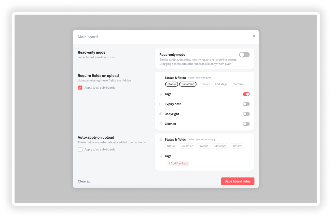
V1 — Upload validations: Admins can set required metadata fields at the board level including tags, custom fields, license, copyright, or expiration date. Assets that skip the prompt upload successfully but are marked “incomplete” and enter a draft state, hidden from the main collection view until resolved.
V2 — Auto-apply fields and tags: Reduced manual tagging burden by letting admins configure rules that automatically apply specified tags or field values to every upload on a board.
V3 — Lock boards (read-only): Added the ability to lock a board entirely, making it read-only for archived projects or finalized asset libraries.
My north star: enforce structure for the admin without slowing down the creator.
Outcome
Learnings
Customer-sourced features ship faster and stick better.
Because this came directly from named customers with specific use cases, I had a reference point for every design decision. That feedback loop cut down on speculation and second-guessing.
Lightweight enforcement > hard gates.
For a product used by creatives under time pressure, flexibility is often more important. Draft states and gentle prompts can change behavior without creating too much friction.
Asset Modal Toolbar
Consolidating editing controls into one place
Background
As Playbook added more editing capabilities and embedded apps, the asset editing interface became fragmented across multiple UI locations. Users had to hunt for actions spread across the modal sidebar and multiple corners of the screen. In parallel, we had been releasing more and more partner mini-apps, and the entry points were cluttered and distracting.
Before

What I Built
This redesign consolidated editing controls into a single central toolbar within the asset preview modal. The new system prioritizes workflow-based actions over individual partner logos and integrates directly with the Miniapp Shop to enable quick asset edits.
- Combined and centered zoom + miniapps toolbars
- Separated light / dark view as a toggle in the lower left corner
- Moved hide asset, permalink, crop, and delete actions into the centered asset toolbar—common actions that apply directly to an asset and were previously buried
- Maintained right sidebar for: reacts, comments, copy, move, search, and less common tools
Dark Mode
Full-product theming across hundreds of components
Background
Since as early as 2023, Playbook's most requested customization had been workspace-wide dark mode, yet it was never prioritized over functionality-driven projects. The team discussed it a few times over the years, but the friction to begin was high and none of the engineers felt particularly inclined to take it on. We would tell users it was “on our roadmap” and “coming soon.”
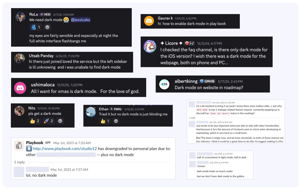
In February 2026, Playbook began making a more concerted effort to reach teams in media and entertainment such as film studios, production agencies, and global media brands. In demos, we noticed a mismatch between our core light, colorful product and the dark themes more commonly preferred by the companies we were speaking to.
This was the tipping point for me. With the power of AI, dark mode implementation felt more like a consolidation and design consistency problem. I decided we had made enough excuses and took on the project ahead of an upcoming product release in March.
What I Built
Over the course of two weeks, I implemented dark mode across the entire Playbook frontend, refactoring and consolidating styles across hundreds of components and systematically updating the design system to ensure visual consistency throughout the application.
We first rolled it out to beta users before launching for all users, gaining 2,000 dark mode adopters within the first month.
Libraries
Scoped access for growing creative organizations
Background
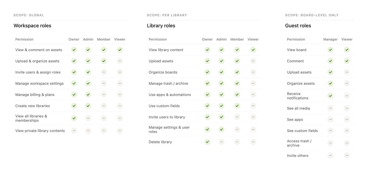
All content in a Playbook workspace lives in one flat space, with access controlled through global roles and per-board guests. For small teams, this works well, but large organizations managing multiple departments, projects, and confidentiality boundaries were often looking for something a little more structured.
As Playbook expanded into the enterprise market, expanding our permissions model and workspace infrastructure to allow for employee and team-level spaces felt more and more necessary.
Libraries was a concept to introduce scoped sub-workspaces within a single company account, letting teams organize content into personal, team-level, and company-wide spaces while keeping administration centralized.
The Problem
The existing permission model forced a frustrating binary: members could access everything, or guests added to individual boards at a time could access very little. Guests couldn't receive notifications, access custom fields, see apps, or manage archived content. The workaround some teams landed on was spinning up entirely separate Playbook workspaces per team, which fragmented their organizations and made cross-team visibility impossible.
One of our first enterprise customers surfaced this directly while managing multiple teams within a single account without clean access boundaries. Their ask was clear: scope content and permissions at the team level, not just the board level.
“Definitely understand there are workarounds like my multi-guest solution or wiring up more slack/email updates, but would love to enjoy the main benefits and features of Playbook members that already exist. Any way we could solve this by allocating/sharding our storage into different Playbook teams instead (i.e. 100tb divided across 4 playbooks)?” — Enterprise customer
My Role
I was the sole designer on this feature, working closely with a backend engineer to scope the concept and permissions architecture required.
- Product: Defined core requirements, evaluated tradeoffs between competing structural approaches, and aligned on a rollout strategy scoped to enterprise plans
- Design: Designed the full interaction model including library creation, browsing and joining, member management, and admin views
- Research: Audited how competing DAMs solved the problem (Air, Frontify, Orange Logic) and pressure-tested the model directly with Italic
Process
Customer research
Working directly with a customer who requested this helped me get specific about what “scoped access” actually needed to mean in practice. Ultimately, they needed flexibility for team leads to manage their own content independently without seeing the content of every other team, while still allowing admins to get a birds-eye view.
Competitive research
I audited how major DAM competitors approached this (Air, Frontify, Orange Logic). Each had a slightly different model, but the pattern was consistent: a scoped container sitting between the workspace and the board, with its own membership and permissions. That framing gave me a foundation to work from rather than starting from scratch.
Exploring structural approaches
After researching, I landed on a solution that would involve carving out scoped spaces within an existing Playbook workspace and expanding our permissions model. One alternative I considered seriously: build from the workaround of creating separate workspaces per team and create a unified admin view. It would've been lower lift architecturally while solving the visibility problem for admins.
I brought this to our backend engineer to pressure-test both paths. His response was clarifying:
“Standardizing to this 'library' system would potentially significantly reduce complexity in our codebase since we can stop thinking of 'organization-level asset access' and 'collection/member-level asset access' — instead, everything moves to 'library-level asset access.' I'm a huge proponent for that change because it could significantly reduce our permission system complexities and open up more efficient systems down the line.”
That confirmed that sub-workspaces was the right structural decision.
Designing the model
Each user could belong to one or more libraries, and each library would carry its own boards, assets, members, and role assignments. Key design decisions:
- Roles scoped per library — a user could be an Admin in one library and a Member in another, rather than carrying a single global role
- Draft state over hard gates — incomplete libraries or pending memberships wouldn't block access, they'd surface clearly for resolution
- Custom fields stay global, display is library-scoped — fields are created workspace-wide, but library admins can configure which fields appear within their space
- Search scoped to accessible libraries — users only see results from libraries they belong to, keeping search clean and relevant
The flows I covered included:
- Library creation and configuration
- Browsing and joining libraries
- Admin visibility and member management from both the People page and within a library
For rollout, I scoped V1 to private libraries with invite-only access and limited creation to Admins and Owners.
Today
Despite internal alignment on the concept and a clear enterprise use case, we ultimately deferred implementation due to other roadmap priorities.
Learnings
Engineer buy-in early is paramount to good design.
Looping in the engineer before locking in a direction was crucial in determining which solution I pursued. The insight that Libraries could simplify the entire permissions architecture wasn't something I could have gotten from user research alone.
Good workarounds delay good solutions.
Because the enterprise customer could manage with separate workspaces, the urgency to ship this never fully materialized. There's a real cost to workarounds that's easy to undercount: the longer users adapt to a flawed model, the harder it is to migrate them to the right one later.
Designing for scale requires thinking in systems, not screens.
The hardest part of this project was designing a permission model that would hold up across dozens of different org structures, team sizes, and use cases. Getting that architecture right mattered more than any individual interaction.